Aspects of Place in Art History
(an on-going musing about landscape…)
Book Review: The Art of Jeremy Gardiner: Unfolding Landscape, published by Lund Humphries (2013)

Jeremy Gardiner (1957- ) aims to help us experience the changing face of the earth and to this end has spent decades exploring the ancient history of the Jurassic Coast. His art is, “A vision of landscape as an inscribed ‘tableau’ of ancient geological or man-made patterns.” (Peter Davies) The work is both constructive and destructive – a building up of layers and a sanding and scratching away of the surface. In this he mimics his ancient subject matter – a World Heritage site, 95 miles running from Orcombe Point in East Devon to Old Harry Rocks in East Dorset, representing 185 million years of the Earth’s history. Here the sea, sky and land meet and the process of evolution seems closer, more apparent – the erosion of cliffs, the forcing upwards of rocks colliding with the rolling countryside. This hugely varied landscape includes cliffs, beaches, landsclides, arches, caves, fosill hunting grounds made popular in the 19th-century, the Isles of Purbeck and Portland famous for export of stone. This place has particular resonance for the artist as it is here he was raised.
The results of Gardiner’s study of place lie within this handsome hardback, which situates him firmly within the history of the great English tradition of landscape painting stretching from Constable to Nash. (Don’t let the blackness of the cover image put you off – inside are page after page of glorious, colourful landscapes.) Its stunning pictures and evocative texts immediately made me want to rush to book a holiday in this region.
Coinciding with the publication of this monograph are two exhibitions in London and Newcastle this Spring/Summer. (Readers may recall Gardiner’s exhibition at Pallant House, Chichester which overlapped with a show of one of his heroes, English modernist John Tunnard.)
His work is full of abstracted forms, with occasional elements of realism. Although pictorial, they are not overly descriptive, they move beyond the picturesque into the geological. The surface of the paintings are routed and planed. Paint pools into crevices, giving the artist’s works a tactile quality. Thus, as contributor Ian Collins tells us, “the worked and reworked surface tell a geological story” and offers us a glimpse of the fragile ecology of this place. Gardiner’s use of materials such as acrylic, wood, gessoed handmade paper sheets and jesmonite (a gypsum-based composite that creates a plastered effect) gives a sense of rock-strata and fossils peeking through the earth. Representations of fossils sometimes do appear as in Morning Mist St. Oswald’s Bay, 2007. Gardiner explains, “it’s the intersection of space and time that gives a place significance for me.”

Above: Jeremy Gardiner painting on Emmetts Hill above Chapman’s Pool, Dorset, 2007
Although place names are referred to, Gardiner’s pictures are more about feelings gained from the place than topographical representation. For the same reason people don’t feature in these sweeping sagas of geological time. Even architectural elements are kept minimal, minor players in a much greater, older game that measures time in millennia. Reminding us that we humans are here but briefly.
Gardiner attended the Fine Arts Department of Newcastle University in the mid-1970s, following in the footsteps of Victor Pasmore and Roger Hamilton who modelled their teachings in the 1950s on the Basic Design course of the Bauhaus. This emphasised technique and the process of artistic creation and was inspired by D’Arcy Wentworth Thompson’s morphological studies. Pasmore and Hamilton’s pedagogic innovations led to the creation of the foundation course, still a unique feature of British art education. The chapter by William Varley gives a valuable first-hand account as a teacher at this school; he writes “[Basic Design’s] purpose is to identity a grammar, a language of form which might be deployed as the student’s content evolved and matured.”
It was here that Gardiner was also exposed to the work of Kurt Schwitters, as Hamilton was responsible for relocating Merzbau (1933) to the Hatton Gallery, part of the University. A Schwitters-like sensibility can be detected in Gardiner’s use of collage elements and what Varley calls a “synthesis of abstraction and empathy” in his work.
This education set Gardiner up well for an Arts Council Artist in Industry posting to Bridon Wire factory in Doncaster. Here he produced highly coloured paintings of machine-inspired abstracted forms before he entered the Royal College of Art in 1980. He had great success early on and his Masters show at the RCA was a sell-out. Various important commissions followed before a fourteen year sojourn to the United States. This allowed Gardiner to experience the expansive landscapes of the mid-West, as well as the cutting edge visual research being undertaken at Massachusetts Institute of Technology and the Centre for Advances Visual Studies. At the latter, Gardiner studied under Gyorgy Kepes – a Hungarian who sustained Bauhaus ideas in the US.
However Gardiner’s life-long fascination with the coast of Southern England continually pulls him back. As Varley writes “In Gardiner’s care [paintings] are invariably a matter of internalising experience and later representing it in felt pictorial forms.” We see occasional over-painting of one scene into another, Cubist-inspired forms and geometric planes. The pictures are evidence of a life-time spent truly looking at this landscape, which he has walked, sketched, motor-biked across and flown over in a light aircraft. His documentation of this area continues with the use of LIDAR data to produce 3-Dimensional models of the terrain (LIDAR, laser light, is commonly used in meteorology to create contour maps). His digital prize-winning work Purbeck Light Years is a computer-driven interactive installation of the Isle of Purbeck and adds a temporal layering to the experience of this landscape, one in which the viewer can navigate through, virtually.
Following in the tradition of British Modernists migrating to Cornwall, Gardiner also paints the West Penwith peninsula. With these Cornish works, he shows himself to be an apt inheritor of the St Ives tradition which includes Peter Lanyon, Ben Nicholson, even Alfred Wallis. Gardiner’s use of marine salvaged wood lends a satisfying irregularity to these works (reminiscent of Wallis’s uses of rough, unfinished boards) and true to form, the artist has authenticated this by making use of materials and equipment of the boatbuilding trade.
The good selection of essays, from writers with differing perspectives, makes this book is a must have for anyone who loves the British landscape and wishes to discover how this vision is being continued by one of our most gifted contemporary artists. This well-written volume is refreshingly free from the currently trendy “art-speak” that too frequently afflicts books on contemporary art these days.
To have any success abstract art has not only to communicate the artist’s intention (whether that be the exterior world or the artist’s interior mind), but it also must actually look good hanging on the wall and give joy to those who may not have heard the back-story or know the theory behind it. I am pleased to report that Jeremy Gardiner’s art does exactly that and the back-story, contained within this book, is equally fascinating.
The Art of Jeremy Gardiner: Unfolding Landscape. Contributors: Wendy
Baron, Ian Collins, Peter Davies, Simon Martin, Christiana Payne and William
Varley. Published by Lund Humphries (Jan 2013), includes 125 colour and 25
b&w illustrations, 270 x 249mm, 160 pages in hardback. ISBN
978-1-84822-100-0. Price £35
The exhibition Jeremy Gardiner: Unfolding Landscape is at the Kings Place Gallery, 90 York Way, London, N1 9AG: 8 March – 26 April 2013. The exhibition tours to University Gallery Newcastle, Northumbria University, Sandyford Road, Newcastle upon Tyne, NE1 8ST: 24 May – 5 July 2013.
A shorter version of this review is published in the Art Quarterly magaine of the Art Fund, June 2013.
Landscape and the London 2012 Olympics Opening Ceremony
I was thrilled to see Danny Boyle’s Isles of Wonder spectacle that was the Opening Ceremony of the 2012 Olympiad use landscape to such great effect. The opening scenes representing historic rural Britain were the archetypal bucolic idyll of wildflowers, thatched cottages, milkmaids and shepherds tending animals, cricket on the green and villagers dancing ‘round the maypole, all watched over at one end by a mound representing Glastonbury Tor capped with a giant oak tree. It called to mind J. R. R. Tolkien’s The Shire, inhabited by hobbits and Richard Adams’s Watership Down. Fluffy white clouds drifted by (apparently equipped with real water), although they were not really needed as a real rain shower only just finished as the show began.
Only missing were Gainsborough’s Mr and Mrs Andrews, the Suffolk landed gentry posing under the sheltering embrace of an old oak tree on their estate. The oak here signifies stability and continuity, and a sense of successive generations taking over the family business. The landed gentry have even been compared to the oak, holding Britain together (see: Hagen, Rose-Marie & Hagen, Rainer (2003) What Great Painting Say, Taschen. pp. 296-300) An apt symbol for a country struggling in recession in the 21st Century?
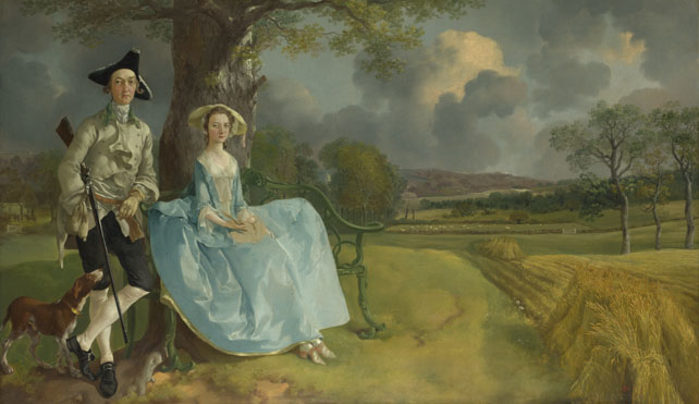
Thomas Gainsborough Mr and Mrs Andrews, oil on canvas, about 1750. In the National Gallery, London
When the Industrial Revolution segment of the show started, presided over by Isambard Kingdom Brunel, the green turf was peeled away by villagers to reveal blackened ground, giant chimneys rose up and promptly began to smoke. The dark satanic mills were upon us as men sweated and laboured at machines in the cause of progress. (Although I didn’t see any starving orphans.)
The film sequence which started the performance proper, (entitled Green and Pleasant Land) was itself a journey from country to city, showing footage of the Thames flowing from its source in the Gloucestershire countryside through to the East End and arriving at the Stadium.
This Opening Ceremony was produced to show the world what Britain was, is and could be and it used landscape to do it – to an estimated worldwide television audience of one billlion. Declaring yet again that landscape is fundamental to British identity and can act as a potent symbol both at home and abroad. When you think about it, what else could Danny Boyle have chosen as the emblematic basis on which to project H.M. The Queen, James Bond, the NHS, Mr Bean and Last Night of the Proms? (To those who object to a Britain portrayed by such cliches, I say at least he didn’t choose Benny Hill!)
Gainsborough’s Mr & Mrs Andrews has been called the “Perfect image of rural England.” (Waldemar Januszczak Every Painting Tells a Story, by ZCZ Films for Channel 5) But the couple only make up half the picture. What Gainsborough’s painting actually shows is the land, fields cultivated using new methods. Mr Andrews is showing off not only his new wife and his land, but perhaps most importantly his utilisation of the latest techniques of agriculture. Higher economic productivity is the source of his wealth. So that ultimately this is not a picture about the past, but a glimpse into what the future holds for the countryside on the cusp of the Industrial Revolution. This will mean hardship for the majority of the rural population, not least due to the enclosures acts (deportation was the sentence for poaching) with the result being a general move off the land towards crowded urban areas where work was to be found.
Danny Boyle’s Olympic interpretation of Britain today began with idealised images of the countryside then moved through to an urban experience with a boy-meets-girl storyline told through the characters’ use of text messaging. Throughout it used digital technology to spectacular effect in the lights and staging around the arena, featured electronic music, and even Britain’s role in the development of the Internet (Sir Tim Berners-Lee made an appearance seated at a desk in front of computer). All of this whilst the audience itself was busy Tweeting, photographing and uploading via mobile phone. It came as no surprise therefore to see the athletes parade onto the ground with their digital camcorders and phones held up high to capture that very audience in the act of filming them.
Be not afeard. The isle is full of noises,
Sounds and sweet airs that give delight and hurt not.
Sometimes a thousand twangling instruments
Will hum about mine ears, and sometime voices
That, if I then had waked after long sleep,
Will make me sleep again; and then, in dreaming,
The clouds methought would open, and show riches
Ready to drop upon me, that when I waked,
I cried to dream again.
The Tempest Act 3, Scene 2
Exhibition Review: Graham Sutherland, an Unfinished World at Modern Art Oxford (until 18 March 2012), is a beautiful exhibition demonstrating how one of the 20th-century’s greatest British painters worked with the language of landscape. Sutherland’s post-war thorn cross and head paintings are well-known, as is his giant tapestry at Coventry Cathedral, but in this exhibition we discovered a more private aspect to his practice and through careful curation learned about his working methods.
On view are around 80 rarely seen works on paper, borrowed from private collections and mostly regional museums (no doubt where much of it generally resides in storage). The various pen & ink drawings, watercolours and gouaches show Sutherland’s almost obsessive drive to paint his subject the English and Welsh landscape, over and over again. Each time he captures something new, a subtle change in form, or light or colour. Of particular note in this respect was Four studies for entrance to a lane, 1939 (collection of Pallant House) small ink and watercolours on what look like pages torn from a sketch or notebook. Here we can see his repetitive workings of the subject produced on the spot, and gain a glimpse of the inner world of his mind in action.
")
Graham Sutherland, Dark Hill – Landscape with Hedges and Fields, 1940. Swindon Museum and Art Gallery © Estate of Graham Sutherland. (From the Modern Art Oxford website)
The exhibition was selected and hung by George Shaw a contemporary painter whose own work centres on depictions of Tile Hill, a post-war council housing estate on the south side of Coventry where he grew up (and in my opinion, the artist who should have won the 2011 Turner Prize). By reconsidering Sutherland through this painter’s eyes we also understand more about where Shaw is coming from in his own work, which uses hobbyist’s favourite Humbrol paints to talk about his sense of memory and loss within decaying suburbia, “a place with nothing but recent history.”
Shaw says, “It is not about place – it is quite abstract. The painting is of how far away you are from there. It is a tethering so you know how far you’ve come. [quote from Daily Telegraph Review, 3/12/11, p.7]
This raises interesting and timely debates around notions of a sense of place. According to Shaw, Sutherland was an artist “much rooted in the past as in the world before him – a world forever unfinished.” Shaw’s world is also unfinished (he is now nearing his 180th painting of Tile Hill). He uses his place – Tile Hill as his device on which to hang timeless painterly concerns, and in so doing he tells us something of the anxieties of 21st-century life.
David Hockney Returns to Landscape
Interviewed on BBC’s Front Row late last year David Hockney declared, “I’m very busy painting England.” For the past several years Hockney has been making a study of the Yorkshire Wolds, (the low hills in the counties of East Riding). He says he’s “painting my childhood” as it was in this part of the county that he spent a summer working as a farm labourer when young. The results, a series of landscape paintings currently on view at the Royal Academy have been the most productive and sustained of his entire career. As was noted in the Daily Telegraph, “They are about particular times, seasons, places.”
With this latest series Hockney is interested in capturing the fleeting effects of weather and light of the land around his home in Bridlington. (In the late 1950s, he escaped provincial Bradford for the Royal College of Art, now he’s back so has come full circle in his maturity.) The area he frequents is a thirty mile radius of his house/studio which he tends to think of as his garden. “Our job is just looking at this, and what a fantastic job it is! … We’re in what we think of as beautiful nature.” His enthusiasm for the area is obvious, as he says that he wants to “make it as exciting as the Grand Canyon. It’s the way you look at things that counts.”
He finds interest in the variety of seasons here, which is wider than in California. When he returned to Yorkshire he decided to build-up a visual vocabulary through studies of trees and by “really looking at things.” This led to sketchbooks filled with drawings of different kinds of grass, hedgerow plants, and so on and through this process for him, “seeing becomes clearer… you realise that there is a fabulous lot to look at.” Closely observing the seasons and changes therein and repeatedly painting the same view, makes him acutely aware of the power of nature and mankind’s small place within it.
Hockney has never been one to shy away from the use of new technology. Whilst a student at the Royal College of Art he embraced acrylic paints when they were still quite new in the 1960s and has used the photocopying machine and a Polaroid camera to create collages, exploiting the unique characteristics of each of these mediums. In 2008 he turned to the iPhone and then the iPad to make drawings. It was the qualities of the backlit LED screens of these gadgets that first captured his attention. Using an app. called Brushes (a virtual paint box) he is able to create colourful digital drawings to email to his friends on a daily basis. He found this to be a “luminous medium and very good for luminous subjects. I began to draw the sunrise seen from my bed on the east coast of England…” The immediacy also proved an inspiration: “[it is an] incredible little thing, really, because it was like a sketchbook with a paint box all in one, and no cleaning up. No mess.”
The iPad is his electronic equivalent of a sketchbook and he carries it everywhere. For an artist who has held a long interest in drawing, the use of a drawing program is a natural extension. Of his practice he says, “Drawing makes you see things clearer, and clearer, and clearer still. The image is passing through you in a physiological way, into your brain, into your memory where it stays – it’s transmitted by your hands.” In fact he has called for a return to studying the discipline of drawing in art schools, as he believes it teaches artists how to look.
The paintings themselves are as much about the act of painting as what he is actually picturing. As viewers we witness the culmination of a life-long process of seeing and learning to look. The final result is a record of the fact that somebody looked at it, and now we’re looking at it. The works demonstrate what has become his trademark bright, cheerful, clean colour, infused with a clear light. Sometimes sombre, bare trees portray a darkness present in nature. They are also on a very large scale, making it possible to lose yourself in the landscape as the space spreads out before you.
Working en plein air in all weathers is something he has not done before (previously he painted in the studio from memory and notes.) Again, the speed of the iPad technology impressed him, as there is no need to wait for previous paint layers to dry. “The more I got into the iPad, the more I realised what a fantastic medium it is for landscape. There are certain things that you can do very, very quickly using it.” For example, he can rapidly fix the essential elements including basic colour and tone of a sky. This is vital under constantly changing environmental conditions. The iPad drawings are printed out on paper for exhibition.
Hockney thinks we are losing our sense of place and wishes to inspire interest in the countryside in general. He thinks England is a beautiful country and we should all get out and see more of it. He hopes the exhibition will inspire people to, “watch the spring, enjoy the world, go outside, have a cigarette while you’re doing it.”
If one of the marks of a great artist is the capacity to constantly and consistently renew one’s art, then Hockney’s place in history is undoubtedly assured.
References:
Peter Osborne, “What Hockney’s return tells us about the mood in Britain”, The Telegraph Thursday 19 Jan 2012
A Bigger Message: Conversations with David Hockney by Martin Gayford, Thames & Hudson, 2011
RA Magazine Winter 2011
David Hockney: A Bigger Picture, DVD, directed by Bruno Wollheim 2009
STANLEY SPENCER AND A SENSE OF PLACE
Artists themselves have the power to create a “sense of place”. Who (apart from its own residents) would remember the little village of Cookham without Stanley Spencer? Spencer will be forever associated with the Berkshire village he used for inspiration – the ordinary streets and places became immortalised in his paintings.
The cemetery became the setting for a series of resurrection paintings which have proved to be some of the most powerful pictures in Britain to come out of the First World War. This was an attempt by Spencer to bring the sublime down to earth, to make real the unknowable by placing it within the familiar. Spencer wished to make Cookham “a heaven on earth”. This is especially poignant in the wake of War II – the fact that people are re-born into that specific, recognisable village (their village) is of vital importance to the meaning and interpretation of the work; yet at the same time Spencer transcends the locality and creates something we can all identify with. Spencer’s pictures are full of detail and what he called “little personal happenings” (quoted in British Masters BBC documentary, 2011) which gives his pictures a sense of credibility and roots them firmly in their place of origin.
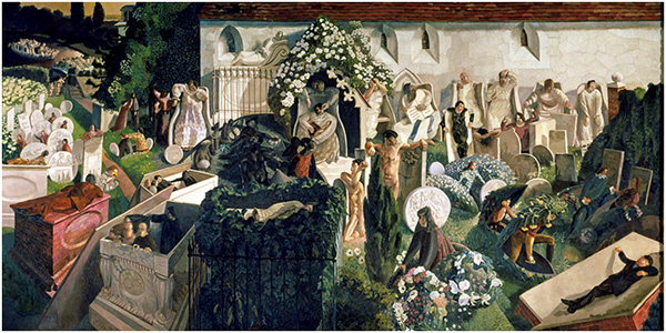
The Resurrection, Cookham by Sir Stanley Spencer, oil on canvas, 1926 in the collection of the Tate Gallery
Find a reading list here
Text and images on this site are subject to copyright and may not be reproduced without permission.